

Most advice on hospital wayfinding design starts in the same place: pick a consistent color palette, increase font sizes, use universal icons, and improve signage placement.
While factors like color-coded zones, landmark-based orientation cues, and clear sight lines at decision points represent the default playbook hospitals and their signage consultants have followed for decades, these recommendations assume a hospital is a single, coherent building with a unified design language.
In reality, almost none of them are. This guide explains:
- Why conventional signage approaches break down in multi-generation hospital campuses
- How a data-first methodology produces better outcomes for patients, staff, and operations teams
Let's dive in.


Where the signage-first approach breaks down in hospital wayfinding
Hospitals don't get built all at once, but rather, over time.
Consider this example:
A surgical wing added in the early 1990s has one signage system—overhead-mounted, navy-and-white directional signs with arrows. At the same time, a renovation in 2021 brings new design dimensions: digital screens and updated branding that only covers the main lobby and two corridors.
Each system was designed well for the space it covered at the time it was installed. But no one designed them to work together.
The result is what's best described as accumulated signage debt, comparable to technical debt in software. Each layer was reasonable when added, but the system as a whole was never designed to scale.
- Color-coded zones that made sense in the original footprint might become contradictory when a patient crosses from an older tower into a new one.
- Overhead signs point toward a hallway that was rerouted during renovation.
- A digital screen in the lobby shows a map that doesn't include the connector corridor to the parking garage.
Multiple design languages plus differing building generations due to years of renovations and updates lead to navigation confusion—and patient friction. The difficulty is caused by too many layers of individually sound signage that were never reconciled.
— Deloitte
Those navigation failures have measurable downstream effects. Patients who can't find their way miss appointments or arrive late and disrupt schedules, while staff spend hours each week giving directions instead of doing clinical or administrative work.
Every wayfinding failure ripples through patient satisfaction scores, operational efficiency, and the bottom line.
The problem is spatial, not visual
If accumulated signage debt is the core failure mode, then the fix doesn't start with graphic design. It starts with spatial data and user flow analysis.
Effective hospital wayfinding design requires three things that signage audits typically miss.
Mapping patient journeys across the full campus
A signage audit evaluates whether each sign is legible and correctly placed. It rarely asks whether the sequence of signs a patient encounters across three building generations tells a coherent directional story from parking to appointment.
Identifying the decision points where visitors most frequently fail
These are rarely where signage committees expect them to be. The highest-friction moments tend to occur at floor transitions between building eras, at junctions where connector corridors bridge expansion phases, and in the gap between parking structures and building entrances—the first 90 seconds of a visit, before any interior signage is visible.
Recognizing that the same facility serves radically different user flows
An ER visitor enters from one direction with high urgency and no advance planning. A scheduled surgery patient arrives with instructions but navigates unfamiliar pre-op corridors. An outpatient lab visitor makes a routine trip but through a different entrance each time depending on parking availability.
One signage system cannot optimize for all three flows simultaneously.
Hospital wayfinding is an information architecture problem that happens to manifest in physical space. Treating it as a graphic design problem addresses the symptom while leaving the underlying system broken.
What a data-first approach looks like in practice
A spatial-data-first wayfinding redesign follows a different sequence than the conventional process.
The conventional process works like this: hire a signage firm, audit existing signs, redesign the visual system, install new signs, and hope patient flows follow. It's a reasonable process for a single building. It fails for a multi-generation campus because it starts with the output (signs) rather than the input (how people actually move).
A data-first approach reverses the order:
- Digitize the full campus footprint. This includes every building generation, connector, entrance, and vertical transition — even spaces that don't appear on current maps because they were part of a previous expansion no one has documented since.
- Map the top 10–15 patient journeys by volume and complexity. Which routes carry the most traffic? Which cross the most building-era boundaries? Which serve the most vulnerable populations?
- Identify friction points using actual navigation data. Track where people stop, backtrack, or ask for help rather than relying on staff assumptions about where confusion happens.
- Layer signage design onto validated flow data. Design the visual system to support the journeys patients actually take, not the journeys the original architects imagined.
The difference is structural. One approach redesigns what signs look like, while the other redesigns where wayfinding support needs to exist and what information it needs to convey at each decision point.

How digital wayfinding changes the story
Physical signage, even well-designed physical signage built on solid spatial data, has a versioning problem. The moment a hospital opens a new wing, reroutes a corridor, or relocates a department, every static sign along the affected path is out of date. Updating them takes months of procurement, fabrication, and installation. In the meantime, the signage debt compounds.
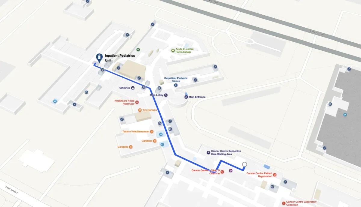
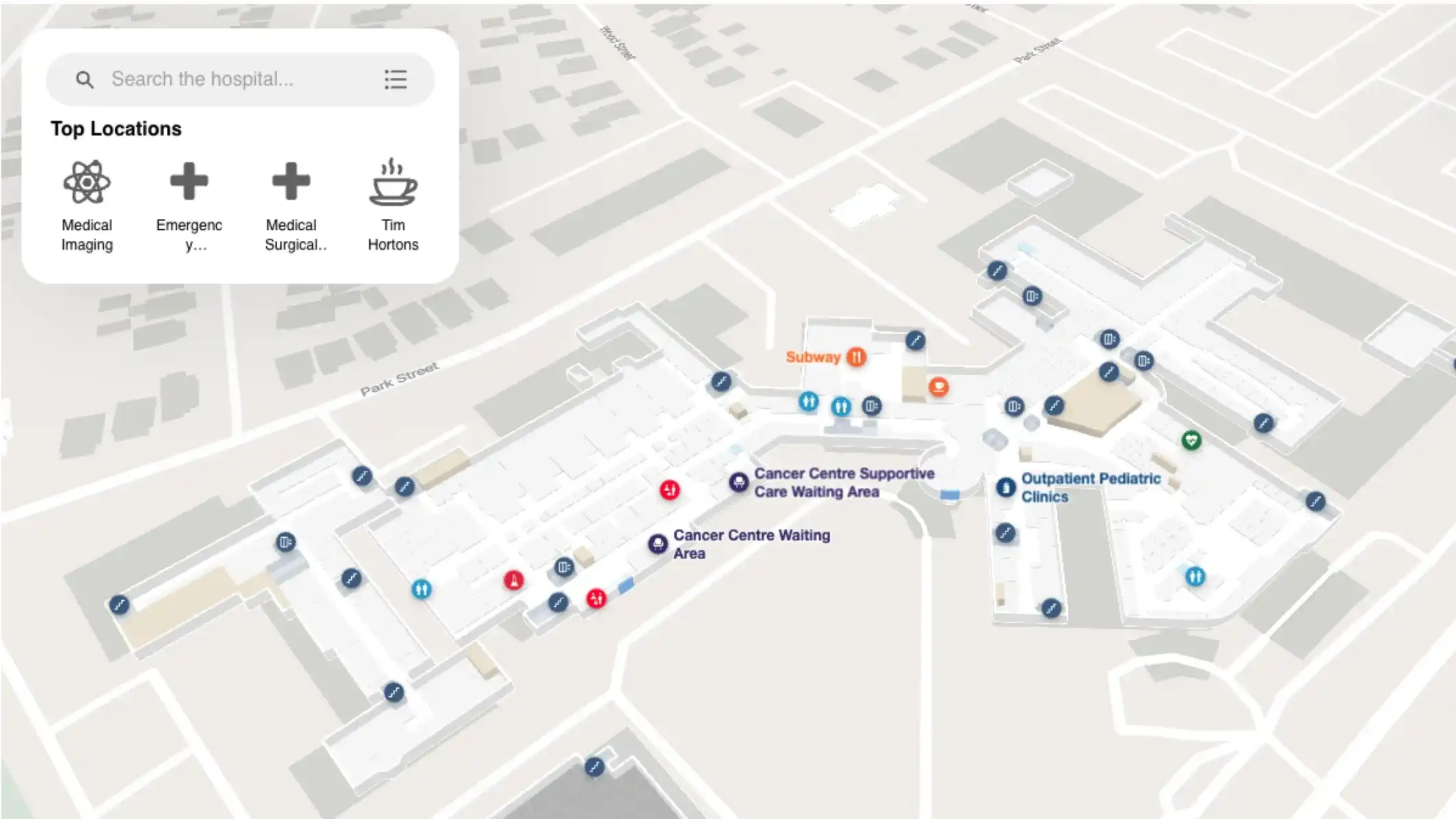
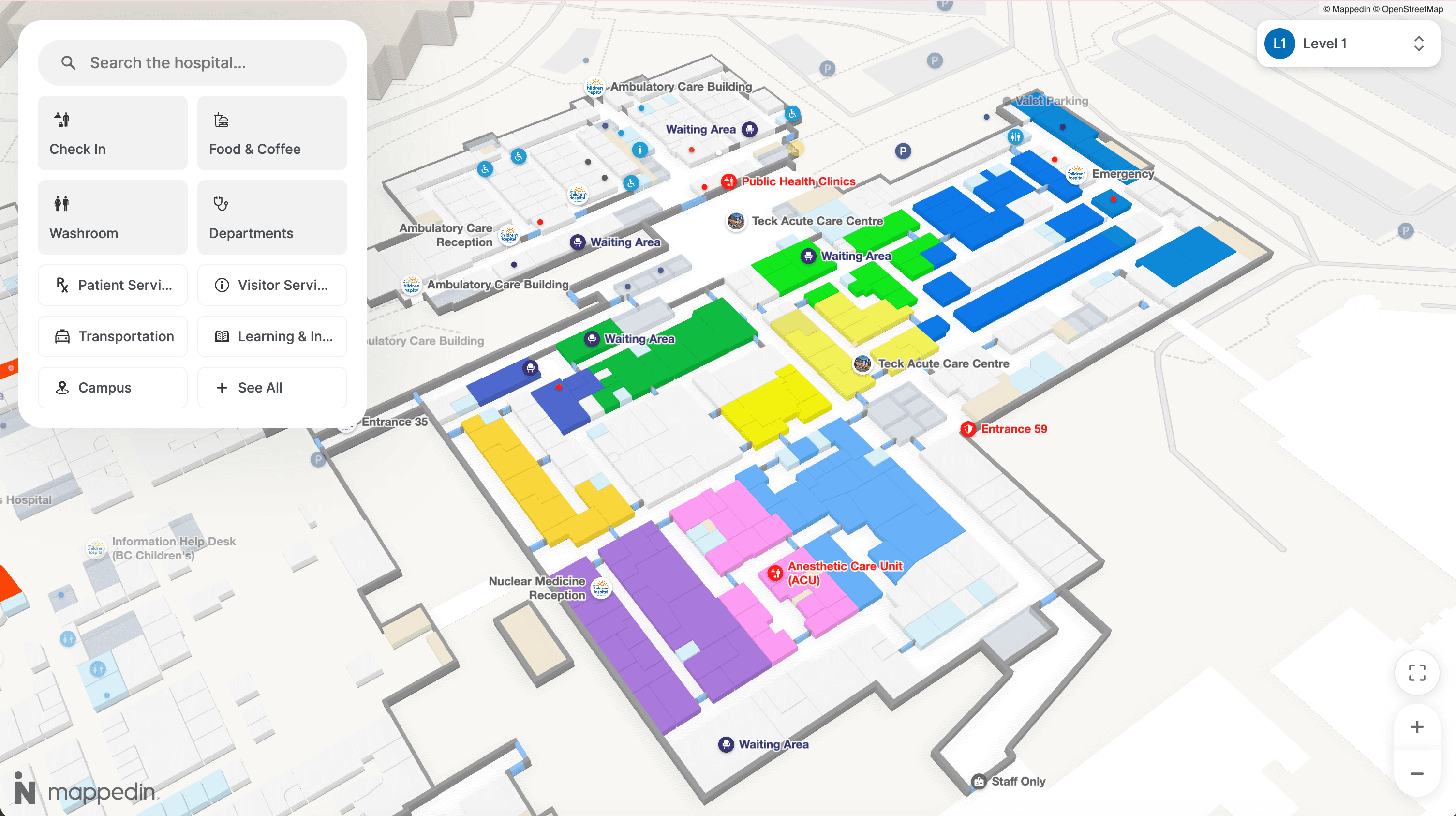
Digital indoor maps address this specific problem. A digital wayfinding layer acts as a single source of truth that spans every building generation and updates in real time. When a corridor closes for construction or a department relocates, the map reflects it immediately — not after the next signage capital project.
A leading solution for hospital wayfinding is Mappedin. With billions of square feet mapped across complex, multi-building venues worldwide, Mappedin is built for the kind of spatial complexity that makes hospital wayfinding design fail: multiple building eras, diverse user flows, and constant physical change.
WCAG compliance, support for 40+ languages, and step-free routing are built in, which matters in healthcare environments where accessibility is a baseline requirement.
Digital wayfinding doesn't replace physical signage. It solves the problem that physical signage alone cannot: maintaining a single, accurate, accessible navigation layer across a facility that never stops changing.


Share