

A hospital lobby usually reveals the actual state of its communications stack faster than any vendor demo. A visitor is late for imaging, a family member is wandering between towers, the front desk is answering the same directional question for the tenth time, and a nurse gets interrupted to explain where cardiology moved after a renovation.
None of that looks like a technology problem at first. It just looks like normal hospital chaos.
But it's actually a routing, messaging, and operational control problem. Digital signage for hospitals works when it reduces that friction without adding new risk. It fails when screens become isolated TVs on walls, managed by no one, integrated with nothing, and excluded from emergency planning, accessibility reviews, and network governance.
For teams evaluating signage, the useful question is whether the deployment will:
- Reduce avoidable interruptions
- Support patient movement
- Hold up under hospital cleaning protocols
- Behave correctly when something goes wrong
Why hospital digital signage is a core utility
A hospital doesn't need more passive displays. It needs reliable communication points in places where confusion creates delay.
That's why digital signage has moved out of the “nice to have” category. The market reflects that shift:
The operational cost of bad navigation
When people can't find a lab, clinic, or registration desk, the immediate problem is frustration. The more expensive problem is what follows:
- Front-desk diversion means staff spend time giving directions instead of checking patients in.
- Late arrivals can ripple into delayed rooms, rescheduled visits, and underused clinician time.
- Missed appointments hurt patient continuity, throughput and revenue.
- Visitor anxiety tends to increase complaints long before anyone reaches the point of care.
Hospitals have always managed these issues with volunteers, paper signs, and verbal guidance. Those tools still matter, but they don't scale well across expanding campuses, department moves, and changing day-of operations.
Why signage behaves like infrastructure
The strongest deployments treat signage as part of the hospital's operating layer. Screens support queue visibility, public messaging, and wayfinding in the same way other utilities support power or access control.
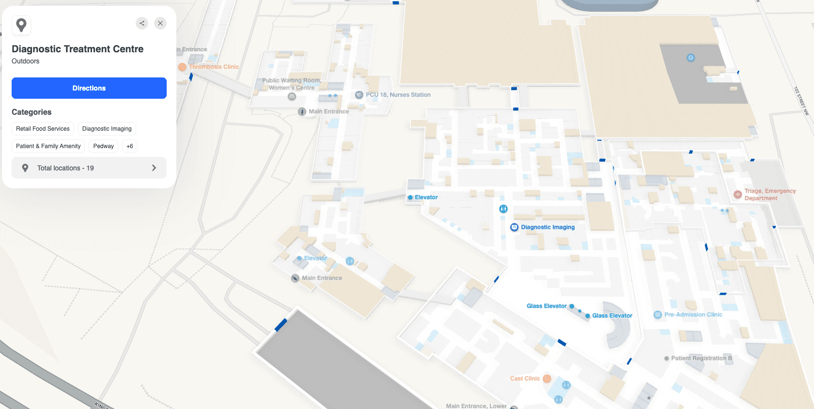
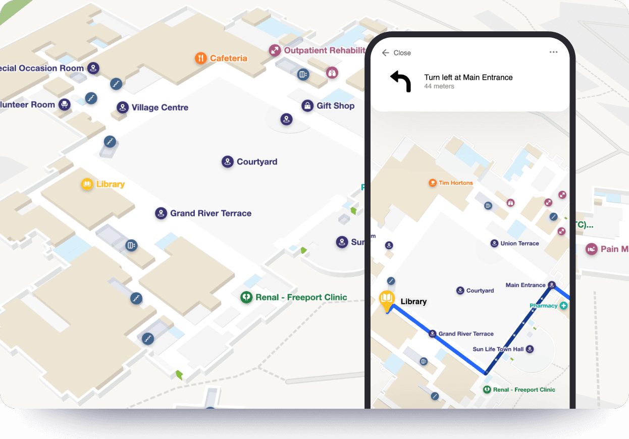
For large campuses, that often includes pairing signage with interactive maps or route guidance. Platforms for hospital and healthcare wayfinding fit into this model when a hospital needs directions to update with the facility rather than lag behind it on a printed map.
Key digital signage use cases that improve hospital operations
Some hospital signage projects fail because the buying team starts with screen locations instead of workflow problems. The better approach is to ask where delays, interruptions, and avoidable questions happen, then design around those points.
Dynamic wayfinding and arrival support
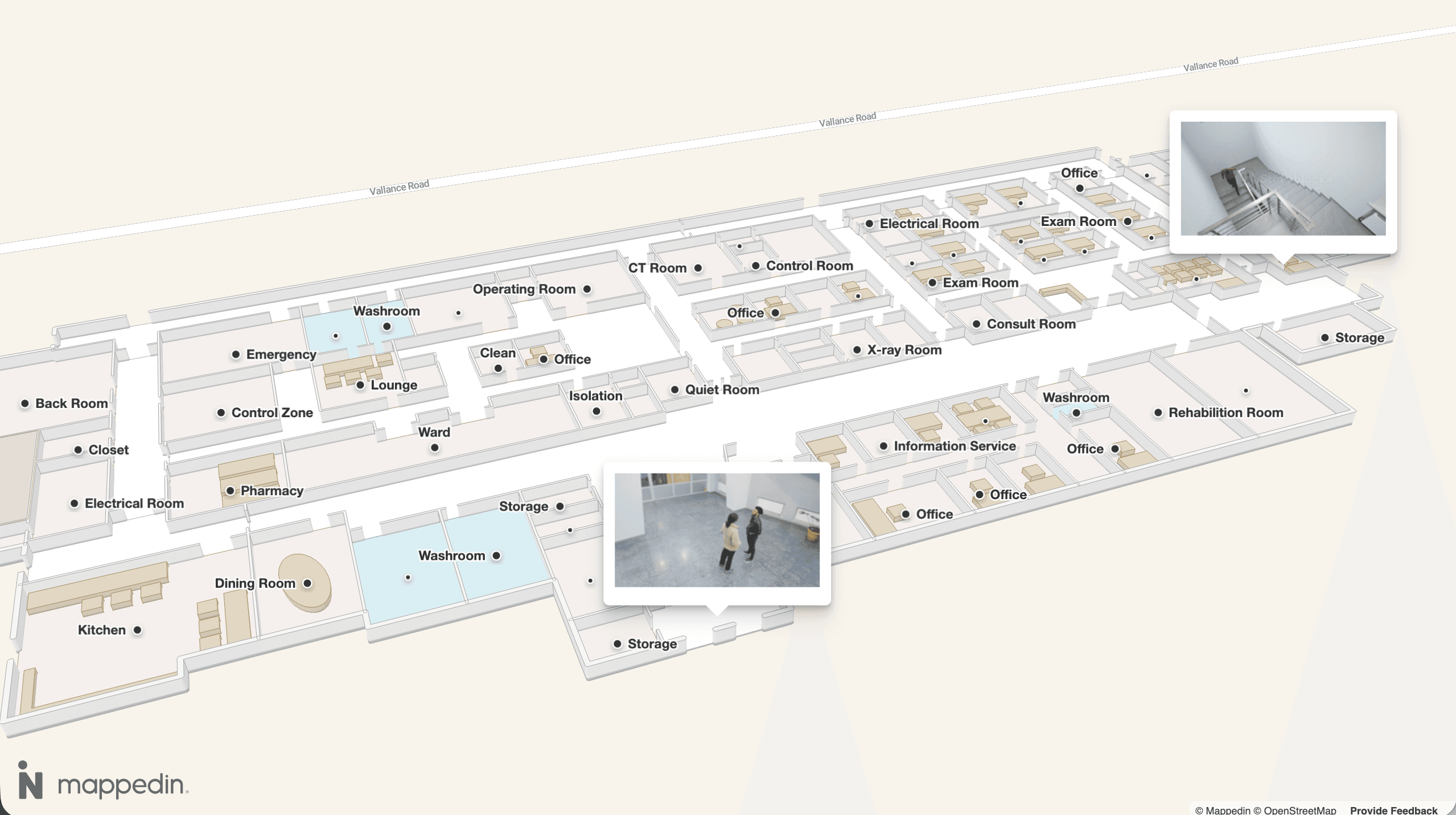
Wayfinding screens near entrances, elevators, and major decision points reduce the “Where do I go now?” burden that usually lands on front-desk staff, security officers, and nearby clinicians. This matters even more after service line moves, temporary closures, or construction reroutes.
The most useful systems don't stop at a static directory. They connect room names, department names, and accessible routes to a map layer that can be updated centrally. That same mapping data can also support related workflows like hospital asset tracking and location visibility, which becomes relevant when operations teams are already building a location-aware environment.
Queue management and waiting room communication
Waiting areas are where signage most directly affects perceived service quality.
That doesn't mean every waiting room needs a content loop full of generic wellness clips. It means people need timely context.
- Are they checked in?
- Is the clinic running late?
- What happens next?
A good queue display lowers uncertainty. A bad one raises it by showing stale numbers, generic messages, or identifiers that create privacy concerns.
Staff communication and operational cadence
Hospitals often underestimate the value of signage in non-public areas. Break rooms, staff corridors, nurse stations, and shared admin spaces are where digital signs can distribute policy updates, scheduling reminders, room changes, and service alerts to teams that don't spend much time at desks.
That works well when:
- Message ownership is clear: HR, facilities, infection prevention, and operations each know what they control.
- Content has an expiry date: Old policy graphics and outdated notices are removed automatically.
- Screen zoning is intentional: Public and staff-only content don't get mixed.
Emergency communication and life-safety support
Public-facing emergency messaging is one of the few use cases where failure has immediate consequences. During an evacuation, shelter-in-place order, or security event, signage needs to switch from normal content to unambiguous instructions without delay.
Hospitals that treat emergency messaging as a future enhancement usually discover too late that their signage platform was configured for marketing convenience, not incident response.


Unlock better patient experience with interactive wayfinding
For most patients, the care experience doesn't begin in the exam room. It begins in the parking garage, at a lobby directory, or on a phone screen. This guide gives Patient Experience leaders a practical framework for turning wayfinding from a persistent pain point into a coordinated, measurable program.
Navigating technical and regulatory requirements
The easiest way to overspend on digital signage for hospitals is to buy hardware that looks fine in a conference room and fails in a hospital corridor. The cheapest display on procurement day can become the most expensive one in maintenance tickets, replacement cycles, and cleaning-related damage.
Start with hospital-grade hardware
Hospital environments are rough on screens. Cleaning protocols, long runtimes, and bright atriums expose the limits of consumer panels quickly.
According to Manuco's guidance on digital signage for hospitals and clinics, hospital-grade screens need:
- Minimum panel duty cycle of 16/7
- 24/7 for never-closed environments
- IPX1 for general areas or IP65 for wash-down zones
The same guidance notes that consumer panels rated at 250 to 350 nits can fail within 12 months when run 18 hours daily because of thermal stress and fluid intrusion from standard disinfecting practices. It also recommends 450 to 700 nits to prevent image washout in brighter public spaces.
Image quality for clinical use
Not every hospital screen is used for diagnosis, but some displays support pathology visualization, imaging explanation, or clinician review. In those cases, image fidelity matters.
General guidelines for clinical-grade visualization:
- ≥350 cd/m² sustained after 1,000 hours
- ≥95% sRGB with DCI-P3, 10-bit internal processing
- ≥60Hz refresh
- 120Hz recommended for live surgical feeds
- Factory DICOM GSDF calibration
Poor bit depth and weak color accuracy can hide contrast detail that staff rely on when explaining grayscale medical images.
Emergency override and compliance controls
Emergency messaging needs network design, not just a checkbox in the CMS. Emergency alert overrides should be configured at the network level before go-live so they trigger instantly and bypass normal content queues. Software-only triggers create avoidable operational risk during a crisis.
Accessibility belongs in the same planning tier. Screens that people can't read under stress aren't compliant in any meaningful sense, even if the hardware is expensive. Hospitals that are reviewing navigation and display systems together usually benefit from a parallel look at WCAG standards for indoor mapping, because route guidance and screen content need the same accessibility discipline.
Security also needs a defined boundary. Any signage connected to scheduling, directories, queue status, or room information should be segmented, access-controlled, and audited so public displays never become a soft target for exposing sensitive workflows.
Developing a hospital signage content strategy
Hospital content fails when it's written like corporate lobby messaging. Patients and visitors don't arrive in a calm, attentive state. Many are distracted, worried, in pain, sleep-deprived, or trying to follow directions while handling insurance, mobility issues, or family calls. And that changes what "good" content looks like.
Design for fast comprehension
Effective content for healthcare audiences should follow the 3 to 5 second comprehension rule and meet a WCAG 2.1 4.5:1 contrast ratio for normal text. The reason is practical: anxious viewers don't process dense paragraphs well, so large fonts, minimal text, and high-contrast visuals are safer and easier to understand.
That rule changes content planning in obvious ways:
- Cut the copy: If a message needs a full paragraph, it probably belongs in a brochure, portal, or QR-linked page.
- Use single-purpose slides: One screen should answer one question, such as where to register or what documents to have ready.
- Prioritize contrast over branding: Hospital palettes often need adjustment on screen to stay readable.
Match content to context and time of day
A children's outpatient waiting room, an overnight emergency department, and a staff break room need different tone, pacing, and scheduling. The same CMS can support all three, but only if the hospital defines who the audience is at each endpoint.
Treat content governance as an operating task
Many hospitals assign signage ownership to marketing and then wonder why the network goes stale. Marketing may own public campaigns, but operations, facilities, patient access, and clinical leadership usually own the content that keeps signage useful.
For teams still defining the category internally, this background on what digital signage is can help frame signage as an operational communication system rather than just a display medium.
The strongest governance model includes content owners, review cycles, expiration rules, and an escalation path for urgent changes. Without that, hospitals end up with polished templates showing old directions to moved departments.


Integrating signage with core hospital systems
A screen network becomes much more valuable when it stops acting like a broadcast channel and starts acting like part of the hospital's information infrastructure. Standalone screens can still deliver announcements, but integrated screens can react to room changes, schedule shifts, route updates, and incidents.
That distinction matters because hospitals don't operate as a single queue. They operate as connected systems with constant movement between departments, buildings, elevators, clinics, and support services.
The difference between isolated screens and a connected network
An isolated screen displays what someone uploaded. A connected signage network displays what the hospital knows right now.
Three integrations usually create the biggest operational shift:
1. Mapping and wayfinding systems
These feed route data, searchable destinations, and accessible paths into kiosks and directional displays. A platform like Mappedin demonstrates this capability, offering indoor mapping that can be fed to every visual channel like website, kiosk, mobile app and QR code, fully editable in minutes by hospital admins.
2. Patient flow and scheduling systems
These support queue visibility, appointment status, and departmental messaging. The main design challenge is privacy. Public displays should communicate progress without revealing protected details.
3. Facility and emergency systems
These connect signage to maintenance notices, room closures, and life-safety alerts so messages reflect the building's real operating state.
A practical deployment and operations checklist
Most digital signage problems are created before the first screen is mounted. Hospitals that deploy well usually spend more time on governance, network planning, and ownership than on template design.
A practical rollout tends to follow six checkpoints.
1. Align stakeholders before procurement
Bring in IT, facilities, security, patient access, infection prevention, marketing, and a clinical representative early. Each group sees a different risk. If one is missing, the project usually gets redesigned later at a higher cost.
2. Audit the environment
Before selecting hardware or software, verify:
- Power and mounting conditions: Especially in older wings and retrofit sites.
- Network readiness: Segmentation, bandwidth, remote management, and monitoring.
- Cleaning exposure: Whether screens sit in general public zones or more demanding sanitation environments.
3. Define endpoint types
Not every screen should do the same job. Separate interactive kiosks, queue displays, lobby directories, waiting room panels, and staff communication boards into distinct endpoint classes with different templates and permissions.
4. Set content ownership and approval rules
Many projects drift at this stage. Decide who can publish what, who approves urgent changes, which content expires automatically, and who reviews stale screens. Hospitals that skip this step usually blame the CMS for a governance problem.
5. Test failure scenarios before launch
Run drills for outages, emergency overrides, content rollback, and disconnected endpoints. A screen network should be tested like an operational system, not a campaign launch.
6. Plan for steady-state operations
After go-live, the work changes but doesn't end. The hospital needs a maintenance rhythm for firmware, screen health, content review, directory accuracy, and staff training. Without that operating plan, even a strong deployment starts decaying in small ways that users notice long before leadership does.

How to select a partner and measure ROI
Vendor selection is where hospitals often get trapped between polished demos and real operating needs. Most platforms can play media. Fewer can handle healthcare governance, support accessible wayfinding, fit into emergency communication planning, and hold up over years of departmental changes.
A useful evaluation process starts with direct questions.
Questions worth asking vendors
Use a shortlist that focuses on operational fit:
- Healthcare familiarity: Have they deployed in regulated care environments, not just offices or retail?
- Integration depth: Can the system connect to mapping, scheduling, room status, and emergency workflows without custom fragility?
- Access control: Can different teams manage different content safely?
- Hardware reality: Do they support hospital-grade displays and cleaning constraints?
- Support model: Who responds when a screen network fails during business hours or after hours?
Competitors vary here, and many have real strengths. Some are stronger in CMS workflow. Others are stronger in kiosk hardware, enterprise display management, or custom integration support. The right decision depends on whether the hospital's bottleneck is content publishing, navigation, security, or portfolio-wide governance.
Build the ROI case around operational outcomes
Hospitals typically achieve ROI on digital signage within 2 to 3 years, primarily through reduced staff inquiries, faster check-ins, and lower printing costs. That's a realistic benchmark for a broad operational deployment rather than a single isolated kiosk.
The weak business case is “screens look modern.” The stronger one is “the hospital will spend less staff time on avoidable confusion and gain more control over facility-wide communication.”
The partner choice should follow that logic. If wayfinding complexity is high, ask vendors to demonstrate live route changes. If emergency messaging matters, ask how override works before the CMS loads normal content. If accessibility is a priority, ask how contrast, readable layouts, and route guidance are maintained across every screen type.
How Mappedin can help
Hospitals evaluating mapping, kiosks, and digital signage together should ask for a live workflow review, not just a product tour. Book a demo with Mappedin to see how indoor maps, accessible routing, and signage-ready wayfinding can fit into a broader hospital communication system.
Related resources:


Share