Start Here
Stacked maps technology enhances multi-story building navigation by consolidating multiple floors into a single, easy-to-understand visual interface for airports, offices, and hospitals. This indoor mapping solution enhances operational efficiency through real-time data visualization, IoT integration, and heatmap analytics that optimize space utilization and resource management. Mappedin’s SDK enables facility managers to track assets, analyze foot traffic patterns, and make data-driven decisions while providing users with seamless navigation experiences across complex multi-level environments.
In today’s fast-paced world, effective navigation and data visualization go hand in hand when enhancing both user experiences and operational efficiency in large buildings such as airports, warehouses, and hospitals. The ability to visualize multiple floors and specific data points on a single map can transform how we manage and navigate these complex environments. One powerful tool that embodies this capability is the Stacked Maps feature in Mappedin’s Enterprise SDK.
What are stacked maps?

Stacked maps allow anyone to view multiple levels of a building in a consolidated, easy-to-understand format. This is useful in a multi-story building where navigating between floors can be confusing. With stacked maps, users can see the spatial relationship between different floors and easily understand how to move from one level to another. Additionally, stacked maps provide stakeholders with unique data visualization which can help inform decisions by analyzing foot traffic flow, identifying prime store locations, and optimizing navigation aids.
Elevating your organization
1. Operational efficiency
Stacked maps offer facility managers increased situational awareness to streamline operations and manage resources across different levels by providing a holistic view of a facility’s layout. For instance, maintenance teams can plan and execute more efficiently by having a clear overview of areas they need to cover–all in one visual interface. This can lead to quicker response times and reduced downtime, directly impacting operational costs and efficiency.
2. Data-driven decision making
Integrating data visualization with maps allows for real-time insights into how spaces and resources are used. Heatmaps overlaid on these views can highlight areas of high activity, guiding layout changes, space utilization strategies, and security planning. Historical data analysis can be an effective way to predict future trends, which empower teams to make informed decisions and optimize spaces in preparation for future demand.
Below are examples of an airport search query heatmap both visualized in 2D and 3D.

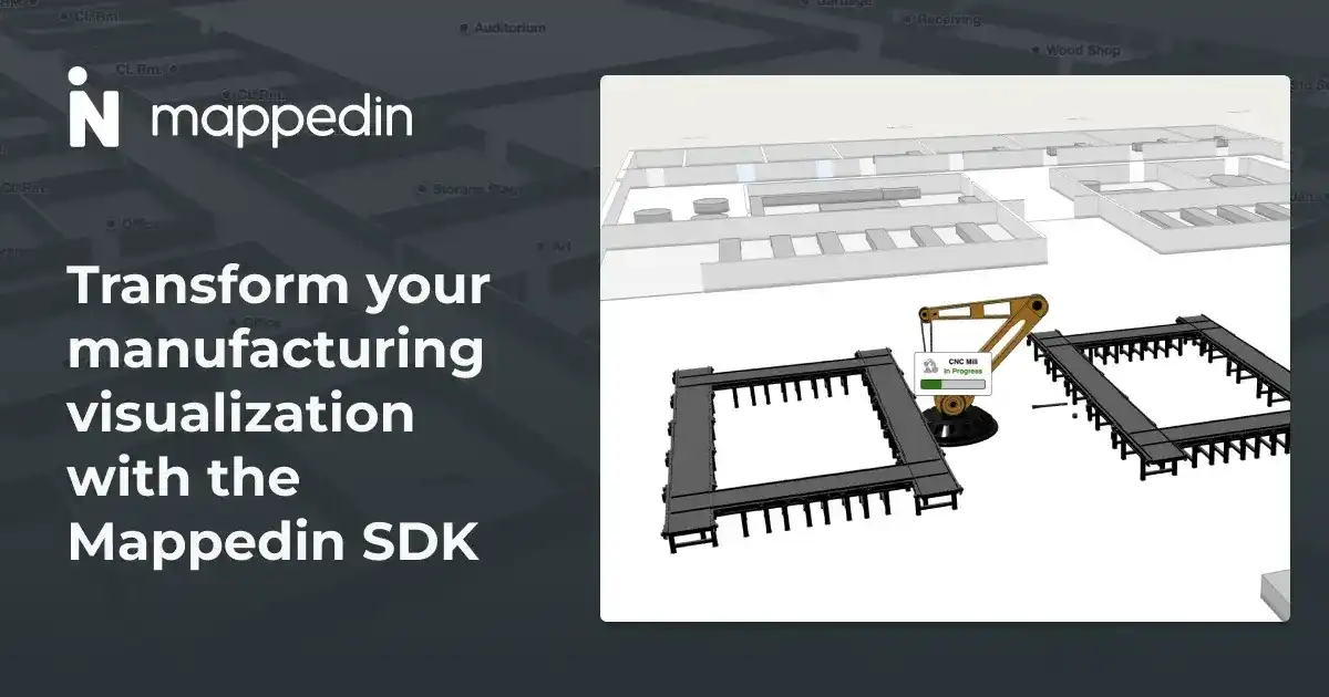
3. Integration with IoT platforms
Integrating information from IoT, or Internet of Things, platforms enables real-time visibility to status and location-based insights. IoT sensors can be used to track environmental conditions, occupancy levels, and even asset movements across different floors, which give users awareness even when remote.
Below is a demo that showcases an airport’s stacked map with wheelchair locations. This visualization makes it easy to see exactly where wheelchairs are available across various levels of the airport at any given time. Such a feature is important for ensuring accessibility and convenience for passengers with mobility needs. It also helps airport staff efficiently manage and allocate resources and ensure wheelchairs are available where and when they are needed.
Use your right click to pan around the venue and observe the moving wheelchairs! Scale the time multiplier to see a sped up view.
Take your stacked maps to the next level
The Mappedin SDK is more than just a mapping tool; it's a comprehensive solution for creating safer, more efficient navigation experiences; whether you’re managing a bustling airport or a sprawling warehouse.
Discover more about how Stacked Maps can provide valuable insights through advanced data visualization. Get in touch with our mapping technologists today to learn how you can make smarter, data-backed decisions, and take your operations to the next level.
Share